Mobile access
The Warp Storm has what is called a 'responsive design', which means that it will display properly on a mobile phone, tablet or a computer without having to switch to a 'mobile' or 'desktop' layout. It will also work seamlessly when switching between portrait and landscape mode on a phone.
You will be able to access all functions of the board on any size screen, although you may find that on smaller screens some functions move place slightly.
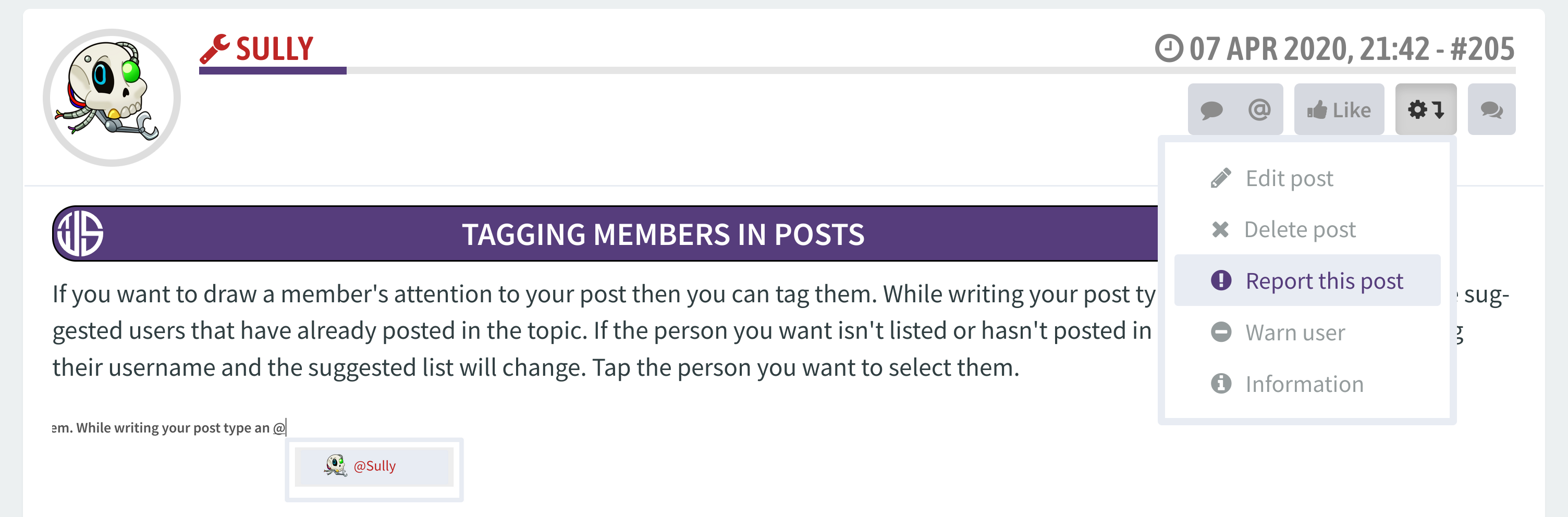
For example, the button to quote a post appears within the drop-down menu in the top right-hand corner.
Large screen:

Small screen:
Changes on smaller displays are simply to free up screen space so that things don't end up looking messy, and you shouldn't have any issues finding things. If something does seem to be missing, or you simply can't find something, feel free to
let us know so we can help.
There are some exceptions where you won't see things on a smaller view.
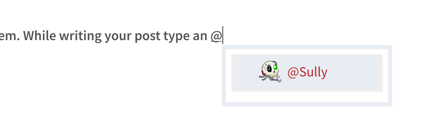
On larger screens when you hover over or click on a post two extra buttons will show up, which allow you to add a quote or a tag directly into the Quick Reply box without leaving the page (great for multi-quoting or tagging!). Additionally if you highlight a text selection of a post a click the quick-quote button only your selection will be quoted.
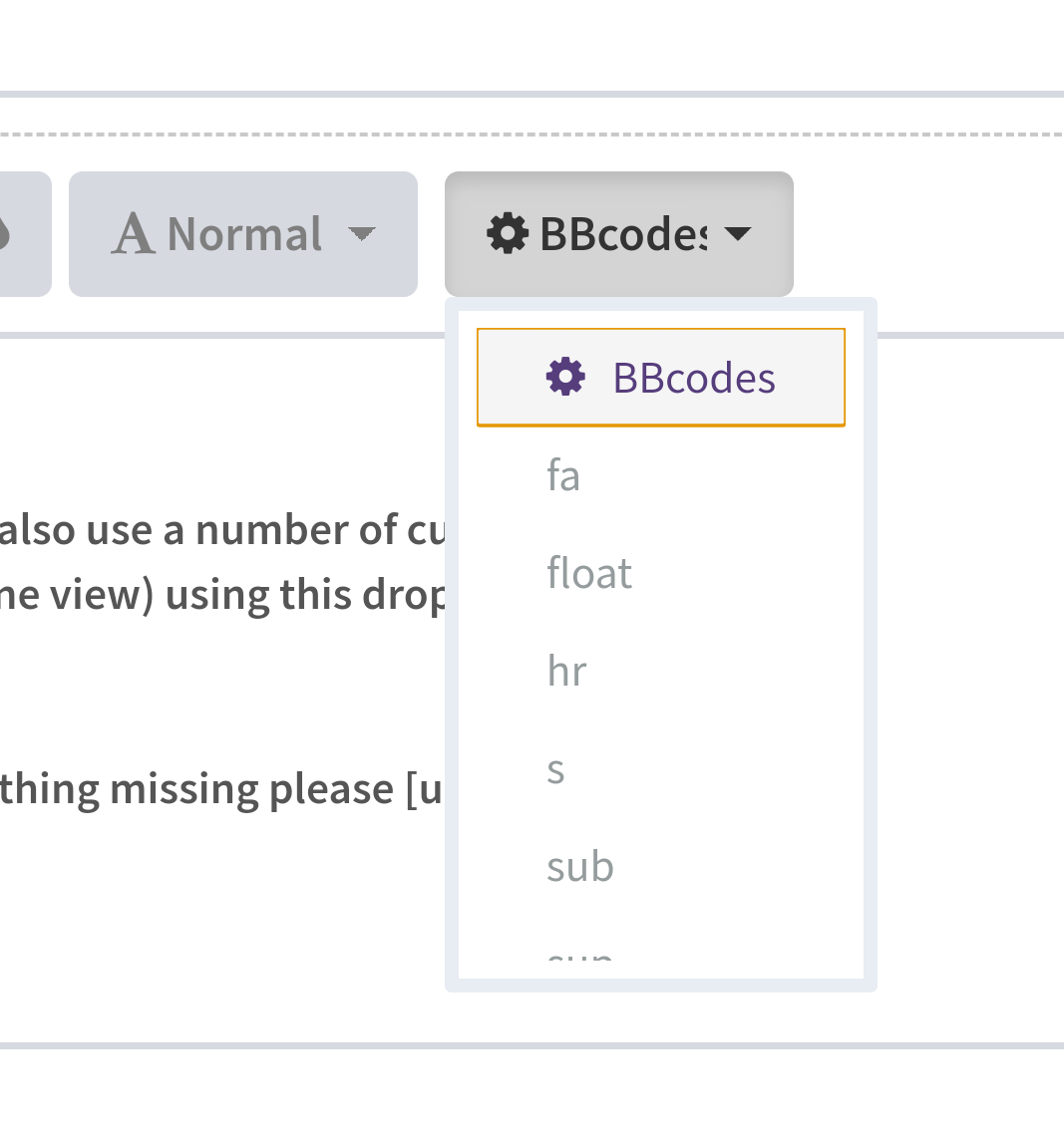
As another example on the posting page you will find that the BBCode bar (containing buttons like
,
and
) is shorter on smaller displays.
Switching to landscape mode on larger phones will display the fully layout. Unfortunately at present users of smaller or older devices may find that their resolution simply isn't large enough to load these hidden elements. This is something we are going to try and fix.
That said, no functions are actually removed or forbidden - even if you can't see the BBCode buttons you can still write it manually, and quoting & tagging can still be done the 'long' way.